5 Tips for Shooting Amazing Hotel Photography like a Pro
“How do I become a hotel photographer “ is the most searched keyword on google about hotel photography. It's becoming a very popular genre of photography, probably as it involves a lot of travel to some amazing hotels and resorts around the world.
This article is not meant to make you a professional hotel photographer on the spot, but I guarantee you that with those 5 tips below, you will shoot much better and professional looking photos.
Whether you own a professional camera or a smartphone, I will teach you 5 fundamental principles you can apply regardless of the type of camera you are shooting with. a DSLR, point and shoot or smartphone.
What is more important than camera tough is having your camera fixed, preferably with a tripod as most of shots will require long exposure times and even a small shake will result in blur in photos.
If you had your camera fixed, Let’s jump straight to 5 tips that will make you take better hotel photography ;
1- Get the composition right.
Composition is the single most important aspect of hotel photography, or probably any kind of photography.
No matter how expensive camera you have or how great designed interior you are shooting, if your composition is bad, the chances you get a decent photo is quite low.
There are countless great articles and videos about general definition of composition in photography that you may find online, so I will simply focus on how it translates to hotel photography.
Although many techniques available in composition, there is no certain right set of rules and there is always room for creativity. Having said, when you are just starting out, I suggest you to go with safe compositions.
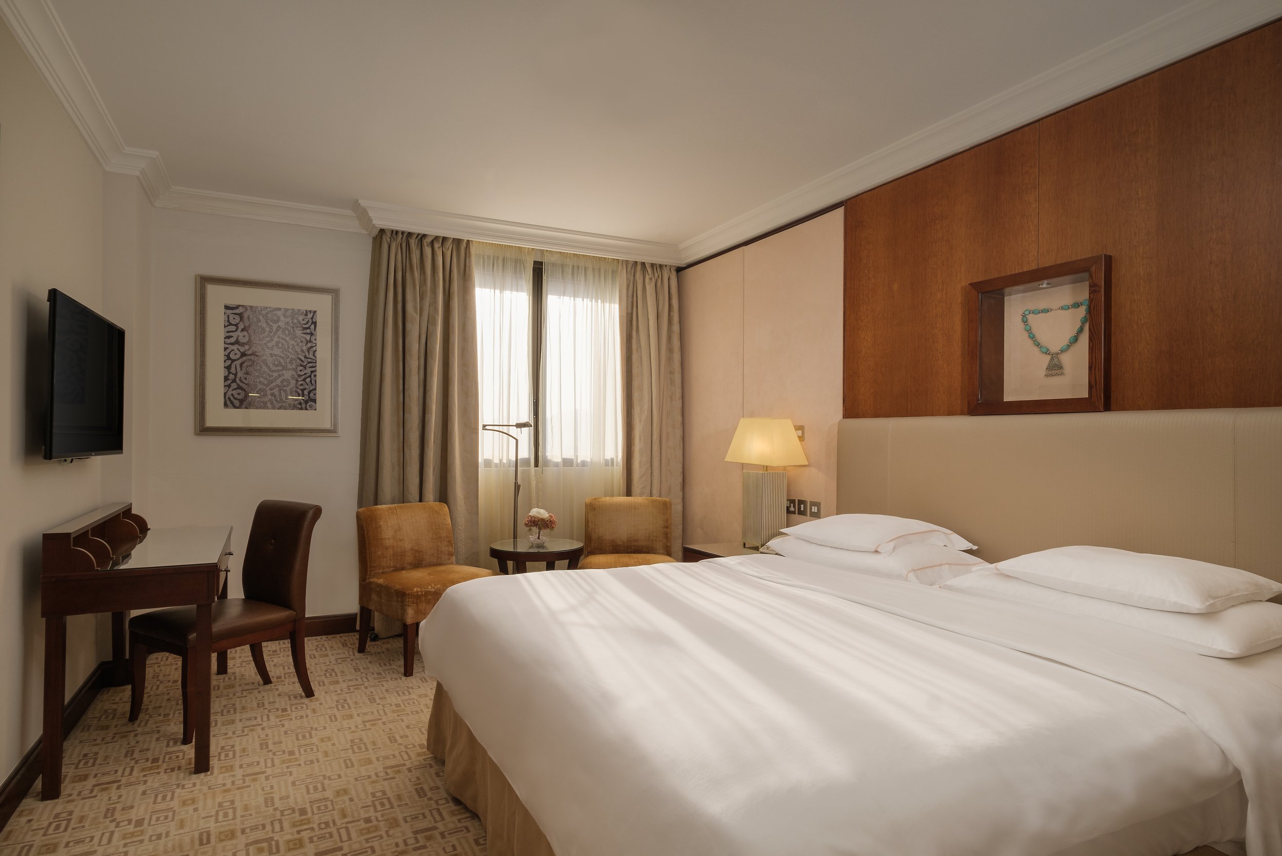
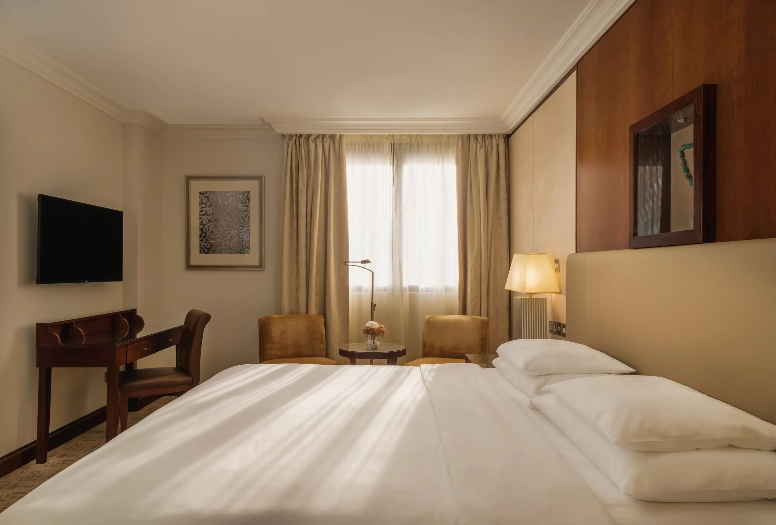
My go-to composition for hotel photography is one point perspective as long as it’s possible.
Simply put, one point perspective is a photo or drawing consist of one single vanishing point; a point in which receding parallel lines meet when shown in linear perspective.
Sometimes because of placement of furniture, certain elements you want to frame or limited space, it’s not always possible to shoot hotels with one point perspective but when I start crawling a space first thing I check is if that’s possible to shoot one point perspective.
One of another very important topic about composition is always to be mindful about big furniture and their distance to camera. Most of interior hotel photography is shot with wide angle lens and those lenses introduce quite significant distortion which makes big furniture even bigger and proportionally weird especially when they are closer to camera. (They actually make all close subjects look bigger but especially big furniture like bed or fridge looks worse when they are closer to camera) To avoid this, try to keep big items as far as possible to camera.
One basic tip about composition is focus on experience rather than physical elements of space.
As you see here in 2 photos, composition makes quite a difference in the image.
2- Make sure it’s well lit before shooting
A well lit room or space is a must in hotel photography. There might be some darker areas like bar or restaurant that can be shot intentionally dark however without a full frame camera, advanced lighting technique and more importantly proper knowledge, most probably those dark photos will not be any good.
So especially when you are just starting out, make sure room or space is well lit; preferable from front or the sides of the camera. Light that is coming from back of camera usually end up with dull and boring photos as it removes texture and dimensionality. Having said light that is coming straight to lens introduce another problem of flare, halos or blooming. Those ruins and softens the photo which is mostly tackled with multi exposure shots by professional photographers.
Your best bet to avoid these issues without going through more complicated solutions is to make sure light coming straight to camera is not that bright. Also set your exposure for inside the room but not the light source itself.
Another important point about light is the high contrast points in the photo. Some space can be well lit but have much darker areas due to design or having one single light source far from dark area. Human eye always tend to look at highest contrast first. So as an example if you have a very dark spot under the chair in a bright room, people will be always drawn to that spot first. Vice versa if you have a properly exposed photo of a room and very bright reflection on a surface, eye will go to that very bright spot immediately.
3- Take your time to stage the space
As soon as you are done with composition and lighting, next important stage of process is staging. For me this is the one takes the most time especially in interior shootings. Sometimes it takes 15 minutes to decide placement of one single small furniture in the frame. This hugely serves overall feeling and also composition of the photo. You don’t want to shoot a very clinic looking space by just removing everything but also not a cluttered space by just propping the scene by spreading all items around. You have to find sweet spot between emptiness and clutter. After you decide furniture and items that you want to have in frame, then you can start tweaking with their placement. Your goal should be leaving items that are serving to overall feel you want to and place them in a way that is won’t distract viewers. Again here there is no right or wrong. It also comes down to your sense of esthetic.
4- Don’t try to fit everything into frame
One big mistake I constantly see is shooting as wide as possible trying to fit everything into frame which usually end up with super boring photographs.
Wide lenses are very powerful tools that has no replacement in hotel photography but it takes quite time to master it and knowing when to go very wide.
If you have a look at the work of best architecture photographers, you will realize they barely go super wide. Usually sweet spot for me is 24 mm to 35 mm. When I need to fit big part of scene into one single image, I use tilt-shift lenses that allow me to shift lens across the sensor of camera so change the perspective. I take separate shots of different parts of scene and stitch them in Lightroom or photoshop to create a seamless and great looking image.
But for whom does not have such expensive equipment (yes T/S lenses are quite big on pocket) it’s best to shoot as zoomed in as possible to avoid distortion and more importantly boring images.
Go as far as possible away from your subject and try to shoot zoomed in if possible.
5- Guide viewers through the space with a flow.
This is important, especially if you are shooting in a hotel room or other area to give a sense of space to viewers. You need to help people understand the flow of interior. How different parts connect to each other and serve to purpose of space.
If you ever hunt for a hotel for your next vacation in booking.com or any other OTA, Probably you see some of those hotel rooms that has many photos, but you can’t really have a sense of space. You try to figure out “where is where” by simply tracking the furniture.
That’s exactly why you need to make your photos lead the way to viewers. Imagine you have a guest in your house and you want to show them your apartment.
Do you simply tell them to discover on their own, or you take them for a guided tour with a flow?
This is a great example of leading viewers through the space. As you see in the photo of the living room of the suite, I deliberately showed the bedroom through mirror as well as part of kitchen on the far left part on the frame. That one frame connects all photos to each other in a way that viewers will instantly draw a virtual layout of the room in their mind.
I covered 5 powerful tips that will improve your hotel photography. By practicing those 5 tips, you will improve your photos much more than any piece of equipment you can buy.
Please share if you enjoyed the article so knowledge reaches to a bigger crowd and check out my other blog posts.


